Build your academy website
A well-designed academy website increases visibility, credibility, and engagement. It also serves as your brand identity and shares your mission and vision with the visitor. In this article, we’ll cover how to build your academy website step by step.
 This site editor is only for academies created on or after December 16, 2024. For academies created before that date, please refer to this help article.
To build your website
- Click Create academy site at the bottom of the left pane. The template window with pre-existing templates will be displayed.
- Hover over the preferred template that will best showcase your ideas and content.
- Click Preview Site to see how the chosen template will appear as your website.
- Click Choose to select the template.
Once the template has been selected, you can further customize the website by adding sections, elements, and widgets. Let's look at the steps to add these components to your website.
Sections
A section on your website refers to a specific part of a webpage. It helps to organize the content and provides a neat and appealing appearance to the audience.
To add section
- Click + Insert at the top menu of the website builder.
- Select the Section option. The categories below will be displayed along with the list of options.
All
Heading
Image
Icon
Box
Tabs
Accordion
Carousel
Maps
Newsletter - Drag and drop the option of your choice on your website builder.
Alternatively, you can also add a section to your website by hovering over the content area and clicking the +Add Section.
To customize section
You can manage and customize the sections on the website.
Hover over the section area.
The following section customization options will be displayed at the top-left of the section area:
Move: Drag and drop the sections to the preferred place.
Move up/Move down: Move the section to one place up or down.
Copy: Copy the section.
Alternatively, you can also copy the section area by hovering over the section area.
Click the copy option next to the Add Section at the bottom of the section area.
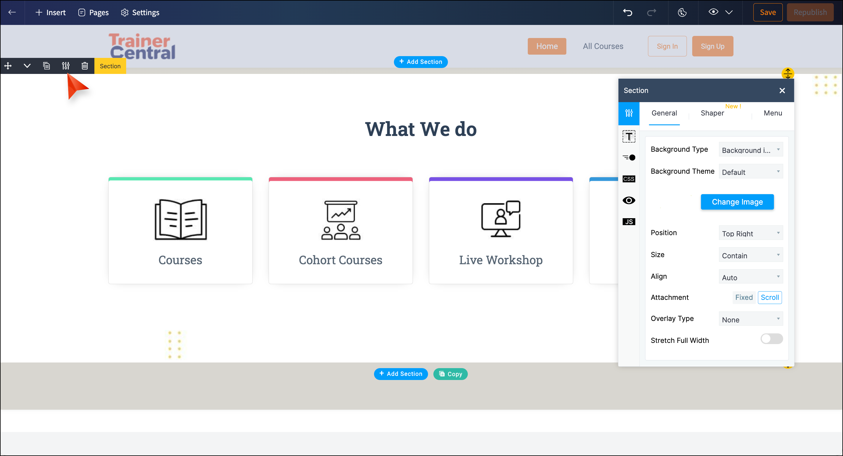
Settings: The settings window will display the following options:
The following section customization options will be displayed at the top-left of the section area:
Move: Drag and drop the sections to the preferred place.
Move up/Move down: Move the section to one place up or down.
Copy: Copy the section.
Alternatively, you can also copy the section area by hovering over the section area.
Click the copy option next to the Add Section at the bottom of the section area.
Settings: The settings window will display the following options:
General: Change the background type, color, and theme of your section.
Shaper: Include pattern in your section. This pattern will be displayed as the background of your section.
Topography: Add border and spacing to your section
Animation: Include animation to display the section when the website is loading.
CSS: Customize your site by writing your own CSS code.
Section visibility: Show/Hide various portions of your website on different devices
JS: Customize your site by writing your Javascript function.
Delete: Delete the section.
Elements
Elements are the individual components that create the structure of your website and contribute to a cohesive user experience.
To add elements
- Click + Insert at the top menu of the website builder.
- Select the Element option.
- Drag and drop the element of your choice on your website builder.
The below options will be displayed under the elements:
Text: Heading, Paragraph
Button: Button, Button with Icon, Signup Button
Images: Image, Image with text, Image with Heading and Text
Icons: Icon, Icon with Heading, Icon with Heading and Text
Content: Carousel,Tabs, Accordian
Container: Box, Row
Divider: Divider,Divider with icon,Divider with text, Spacer
Others: Google Maps, Audio,Video, Table, Embed Iframe, Code Snippet, Newsletter, Menu, Social Profile.
You can categorize elements in two sections, such as rows and columns.
Alternatively, you can also add elements to your website by hovering over the content area and clicking the +Add Elements at the bottom of the element area.
To customize elements
You can manage and customize the elements of your website.
Hover over the element area.
The following element customization options will be displayed at the top-left of the element area,
Move: Click the Move icon to drag and drop the elements to the preferred place.
Copy: Click the copy icon to copy the elements.
Alternatively, you can also copy the element area by hovering over the element area.
Click the copy option next to the Add element.
Settings: Click the settings icon next to the copy icon.
Click the copy option next to the Add element.
Settings: Click the settings icon next to the copy icon.
The settings window with the following options will be displayed:
Typography: Add border and spacing for your elements.
Animation: Add animation to elements.
CSS: Customize your site by writing your CSS code.
Section visibility: Show/Hide various portions of your website on different devices
JS: Customize your site by writing your Javascript function.

The following additional settings are displayed for each element:
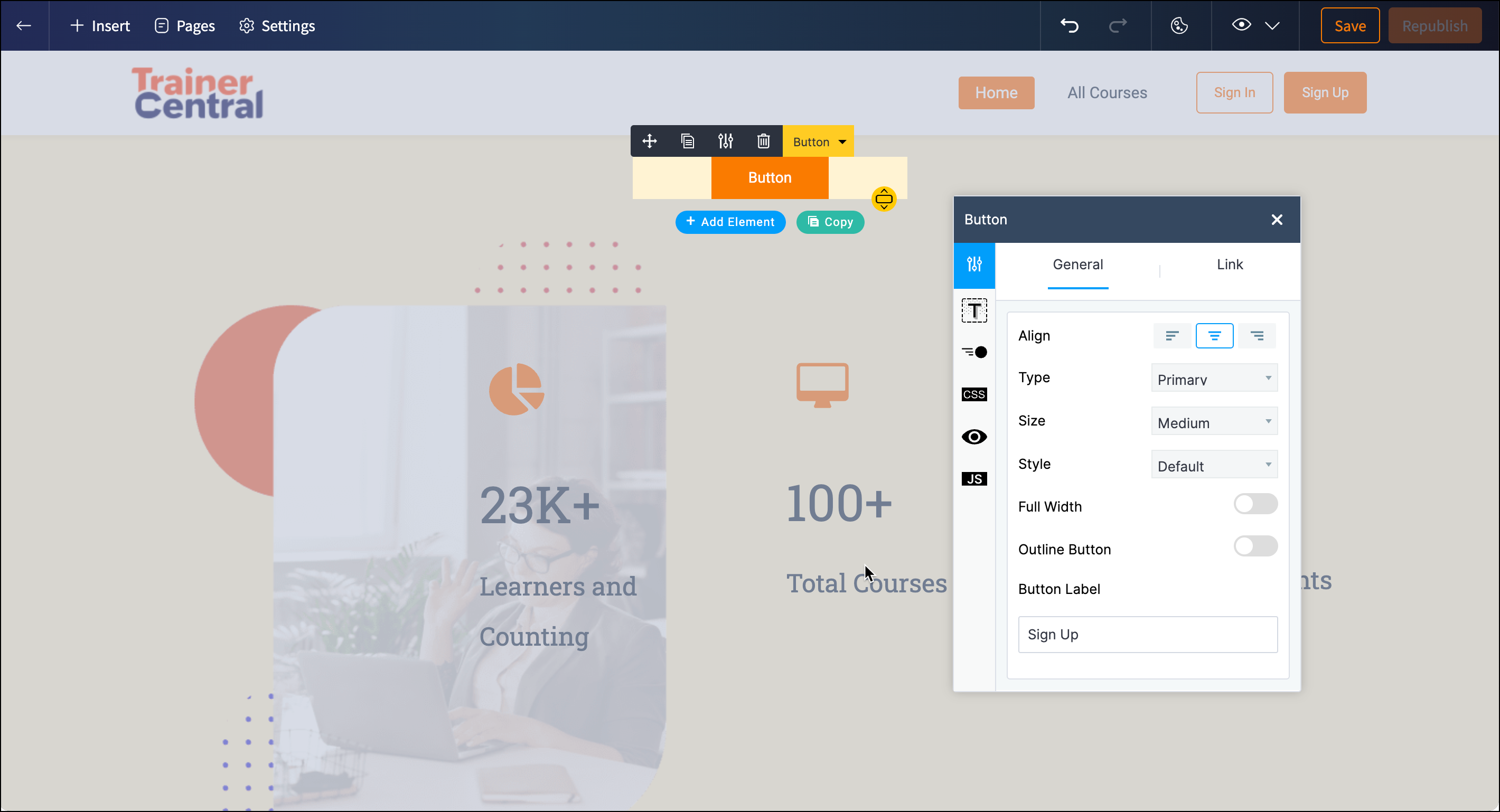
For Buttons:
For Buttons:
General: Customize alignment, type, size, style, and button label.
Change Link: Set or modify the button's link using this option.
For Images:
General: Change the image, adjust alignment, and add text.
Link: Assign a link to the selected image.
Caption: Add and customize a caption for the image.
For Icons:
Along with the above settings, you can choose an icon from the library or files and customize its alignment, size, style, and color.
For Containers:
Box: Include an option to enable stickiness.
Row: Display settings to adjust the element placement ratio.
For Dividers:
Icon Divider:
General: Change the icon from the library and files.
Style: Customize alignment, size, style, icon color, and line color.
Text Divider: General: Adjust alignment, style, double border, and divider text.
Style: Customize text style, icon color, text color, and line color.
If the element is Divider: Spacer, only the visibility and JS tab will be displayed.
Delete: Delete the element.
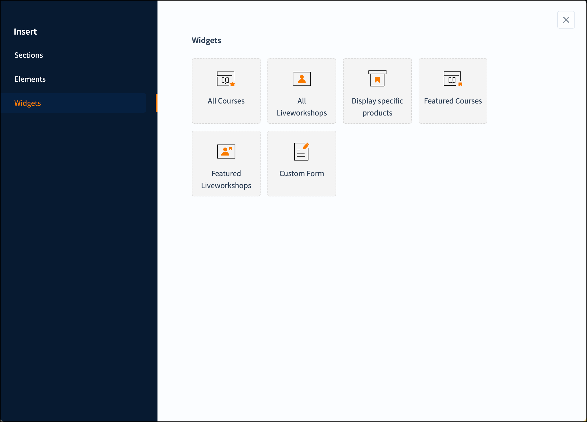
Widgets
A widget is an interactive element embedded on your website to provide easy access to the application, such as courses and live workshops. It boosts user engagement and offers greater customization for improved usability.
To add widgets
-
Click + Insert at the top menu of the website.
-
Select the Widgets option.
The following options will be displayed:
All Courses
All LiveWorkshops
Display specific products
Featured Courses
Featured LiveWorkshops
Custom Form
-
Drag and drop the widget of your choice on your website builder.
To customize widgets
You can customize the widgets on the website.
Hover over the widgets area.
The following widget customization options will be displayed at the top-left of the widget area,
Move: Drag and drop the widget to the preferred place
Settings: The settings window will display the following tabs:
The following widget customization options will be displayed at the top-left of the widget area,
Move: Drag and drop the widget to the preferred place
Settings: The settings window will display the following tabs:
Layouts: Choose the preferred layout from the displayed layouts.
Settings: Select how to display the products based on the sort by and products per page.
- For the display specific products widget, Products and Layouts tab will be displayed.
In the Product tab, click the Add Products button. Select the preferred courses and live sessions.
In the Layouts tab, choose the preferred layout from the displayed layouts. - For Custom Forms, only the Choose form dropdown will be displayed.
Delete: Click the delete icon to delete the selected widget.
You can further add webpages to your website to enhance engagement. Learn how to add webpages to your website
Now, your website is ready for publishing. Learn how to publish your website
Related Articles
Customize website setting
A captivating and user-friendly website is paramount in improving visitors' browsing experience and enhancing your brand credibility. Let's look at the steps to customize your website according to your preferences. This new site editor is only for ...Steps to migrate to the new website builder
In TrainerCentral, we have launched a new website builder to enhance your website-building experience and strengthen your academy’s online presence. By migrating your website to the new builder, you can create an intuitive, professional, and ...Publish your website
Once you have built your website and configured the settings, you can bring it live for visitors to access. Let's look at the steps to publish your website. This site editor is only for academies created on or after December 16, 2024. For academies ...Live workshop - Customise website
TrainerCentral allows you to customize the website of your live workshop to suit your branding preferences. You can choose from various themes, add sections, alter navigation, and much more. Edit the site layout You can edit the background image, ...Add webpages to your website
A website is made of several pages that can showcase your offerings in detail and drive leads and sales. TrainerCentral's website templates include three default pages: Home Page, All Courses, and All Sessions. You can also add additional webpages to ...